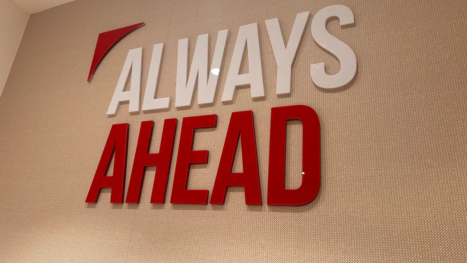
Always
Ahead
MEDISON
Solutions
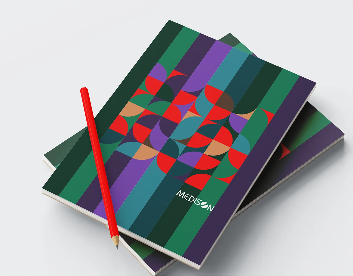
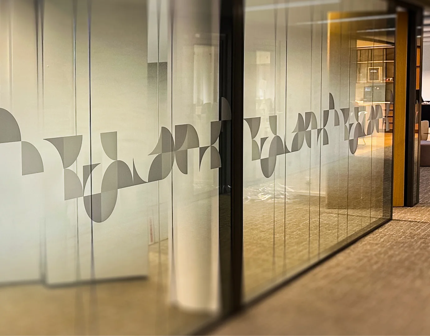
Logo Medison, Global Workplace Branding Language, Wall design
Industry
Medical



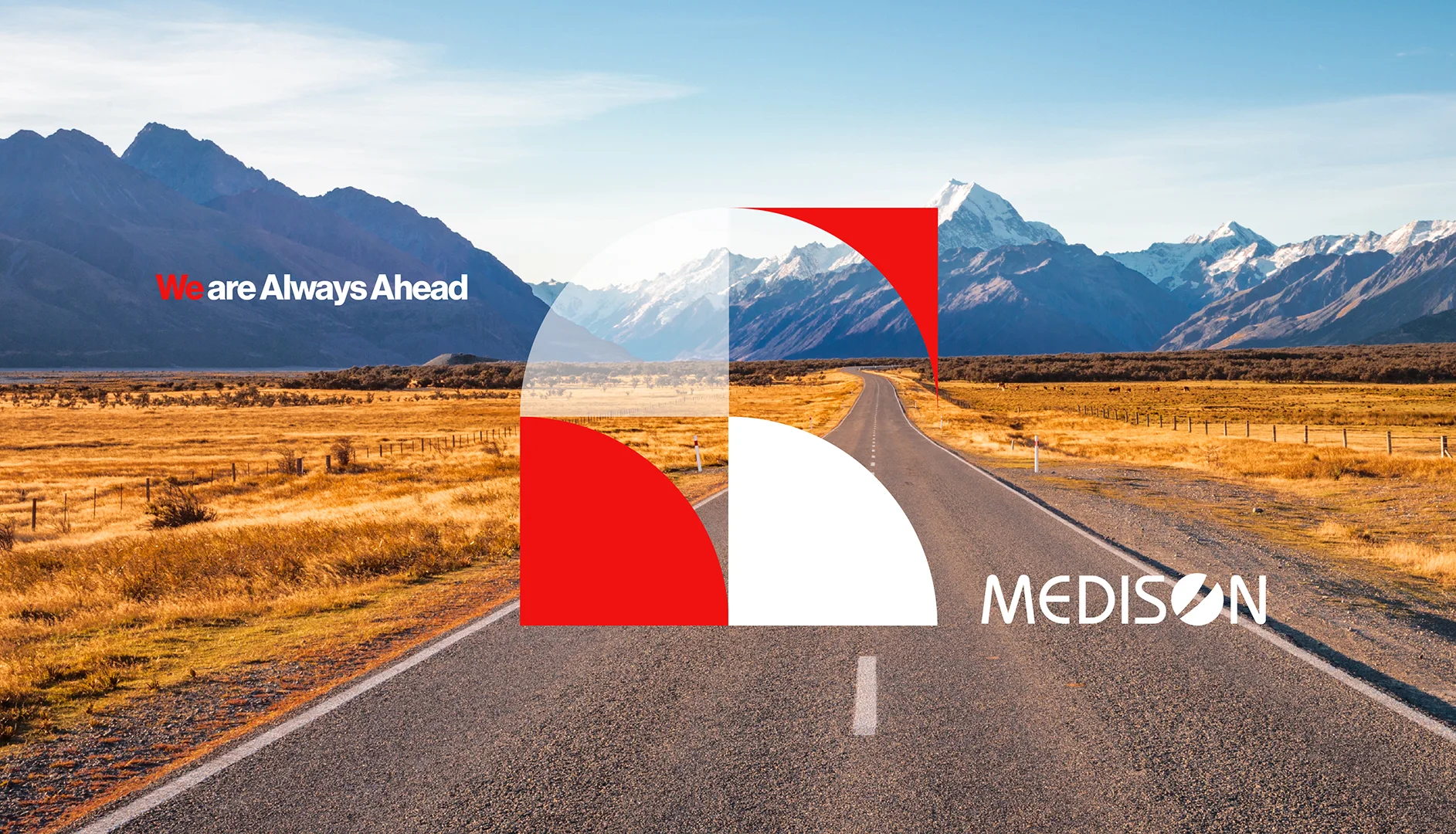
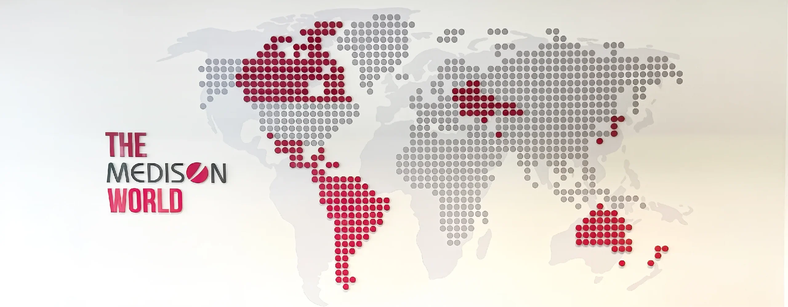
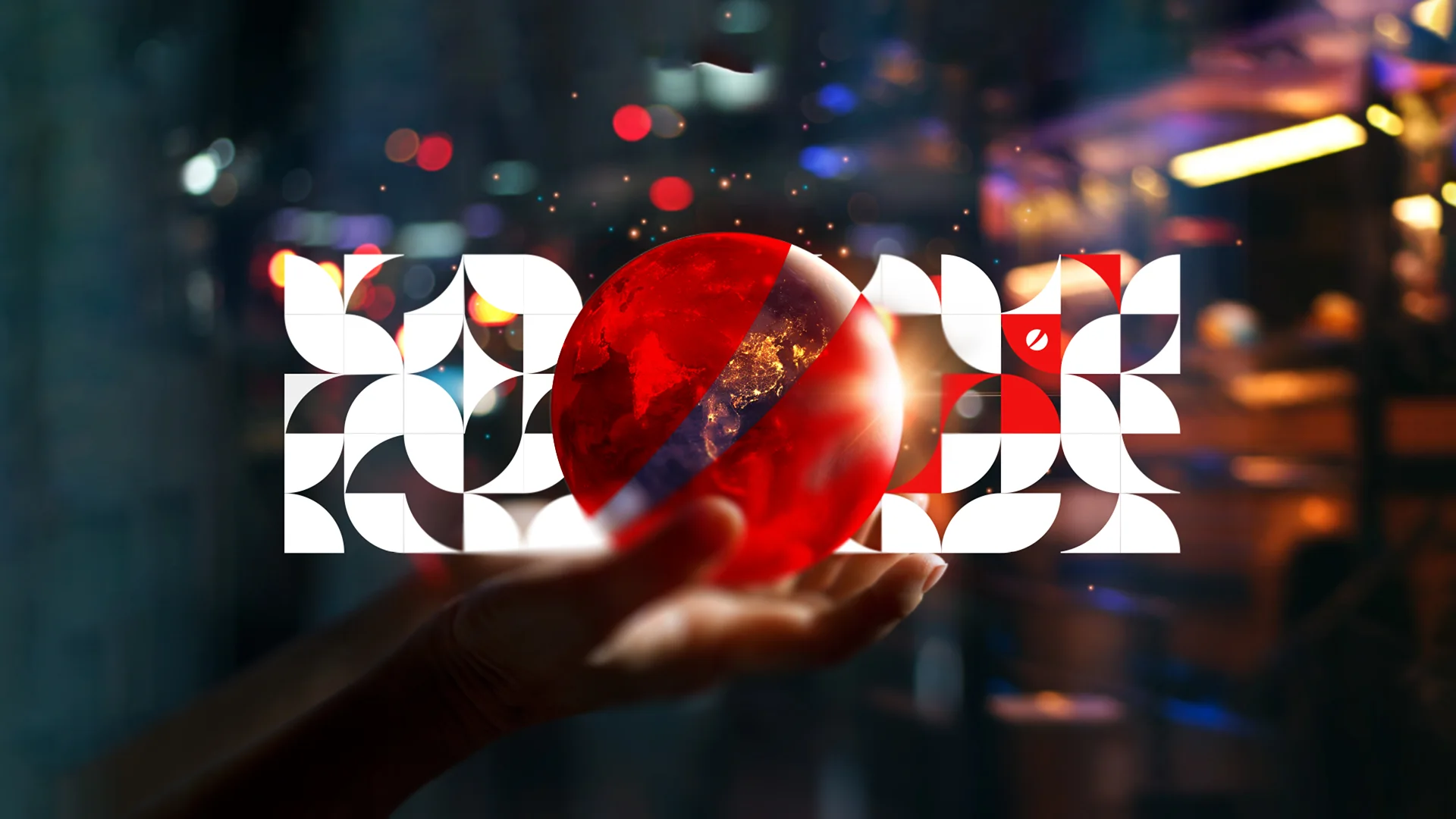
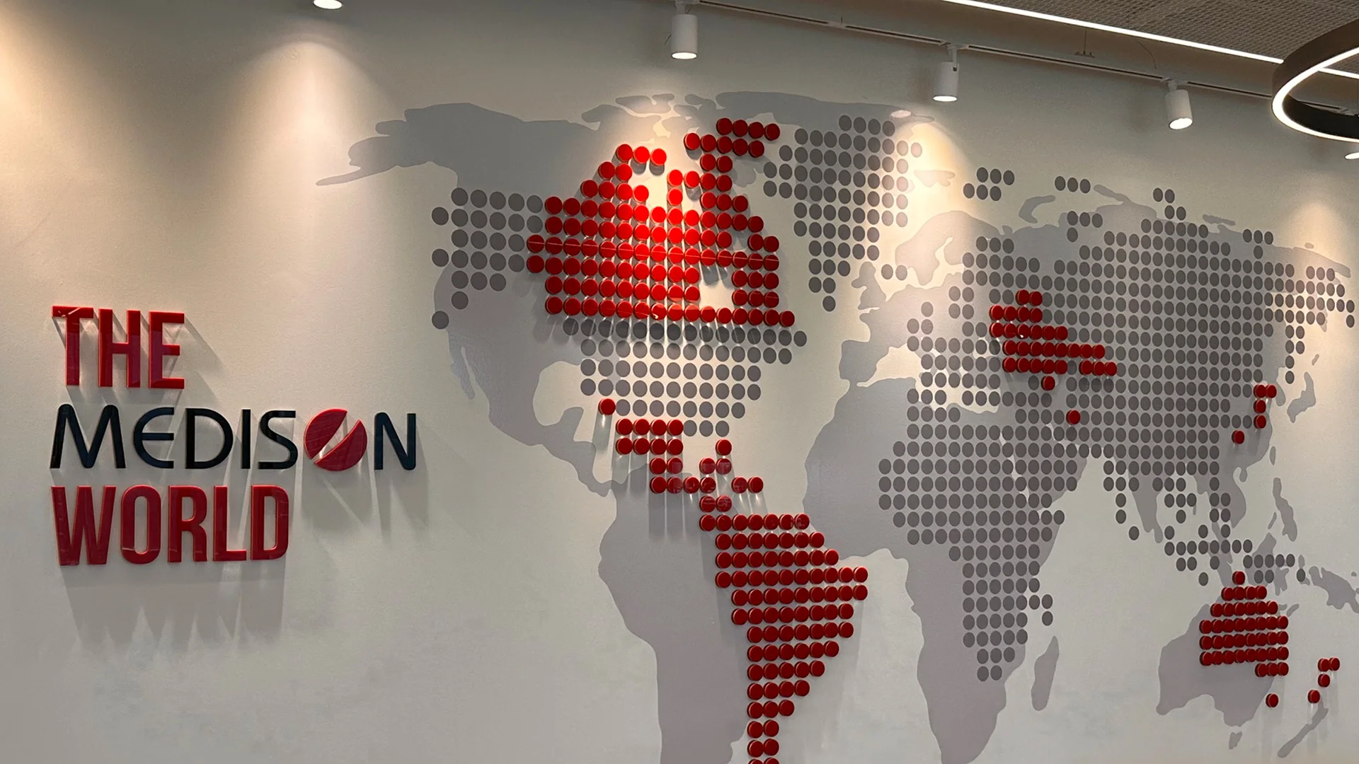
For more than two decades, Razgroup has partnered with Medison, shaping its brand journey from the creation of the company’s iconic logo, now recognized in more than 40 countries, to the development of its new global workplace branding language. As Medison entered a new strategic chapter, we were entrusted with translating its renewed vision, values, and international growth into a cohesive environmental experience.
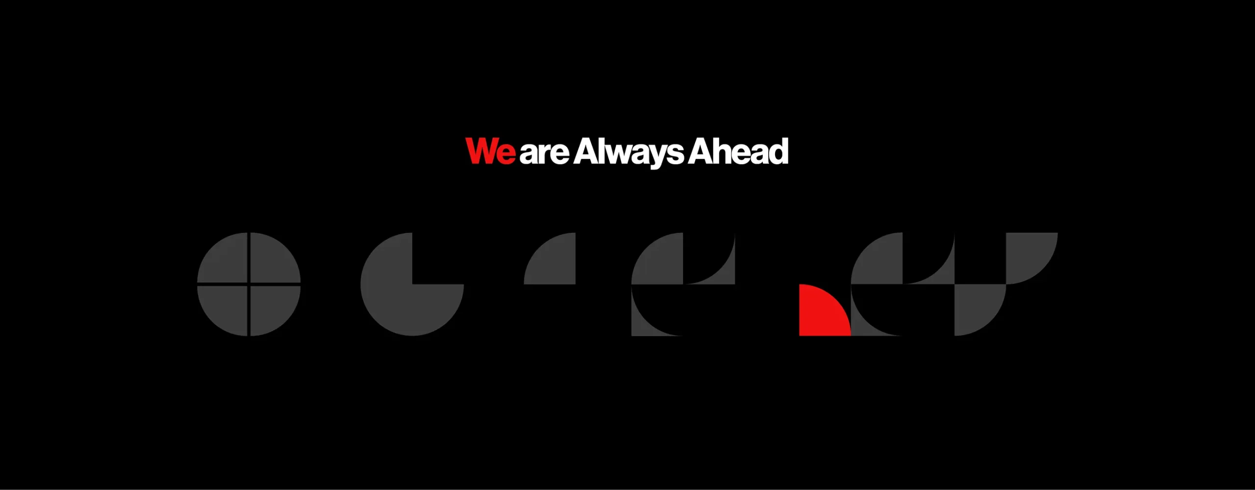
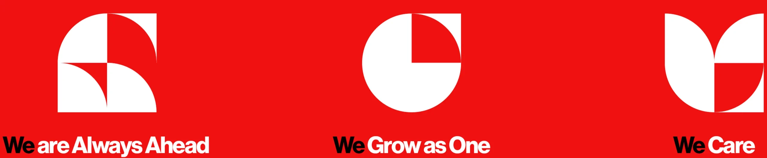
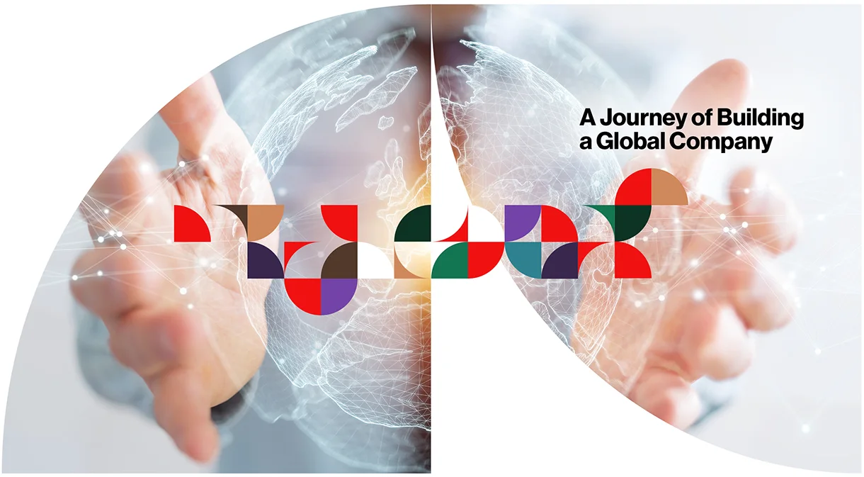
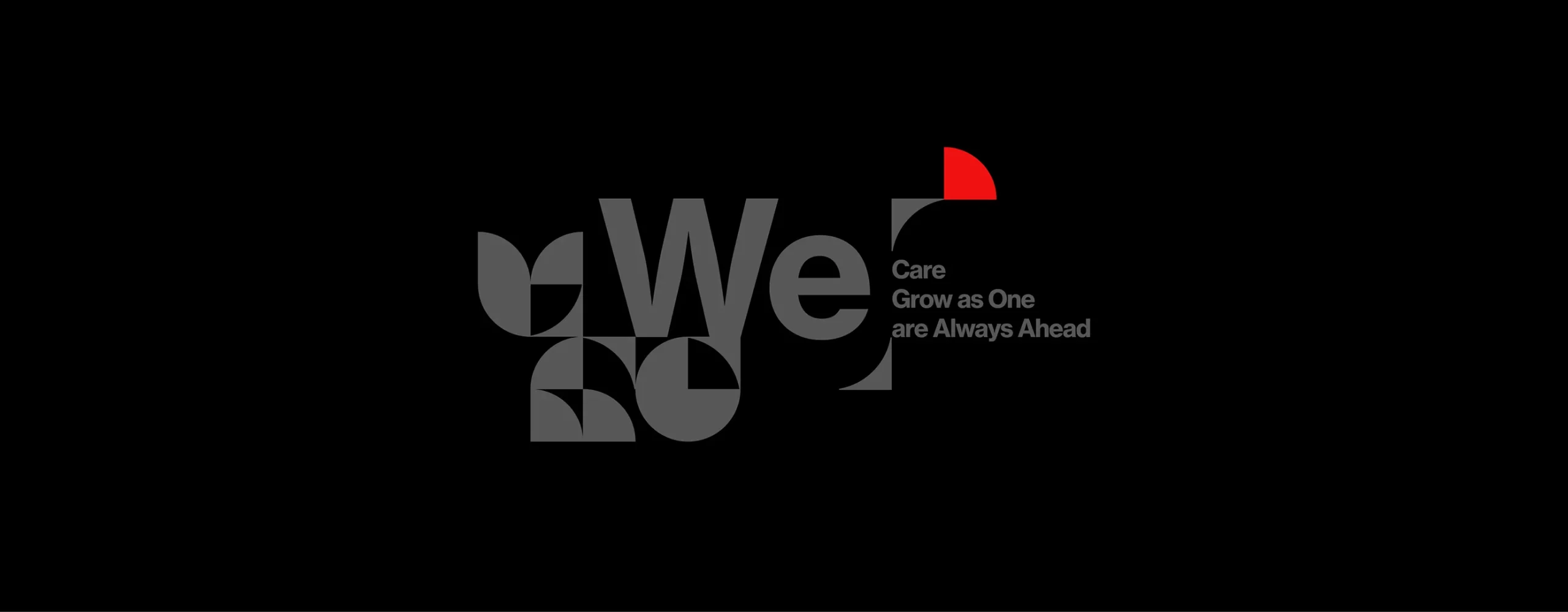
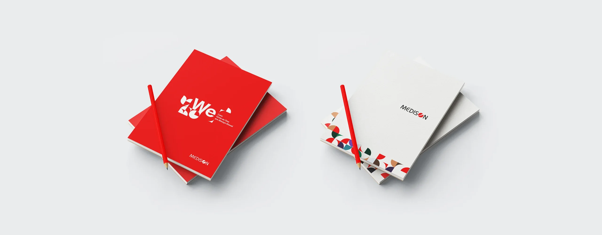
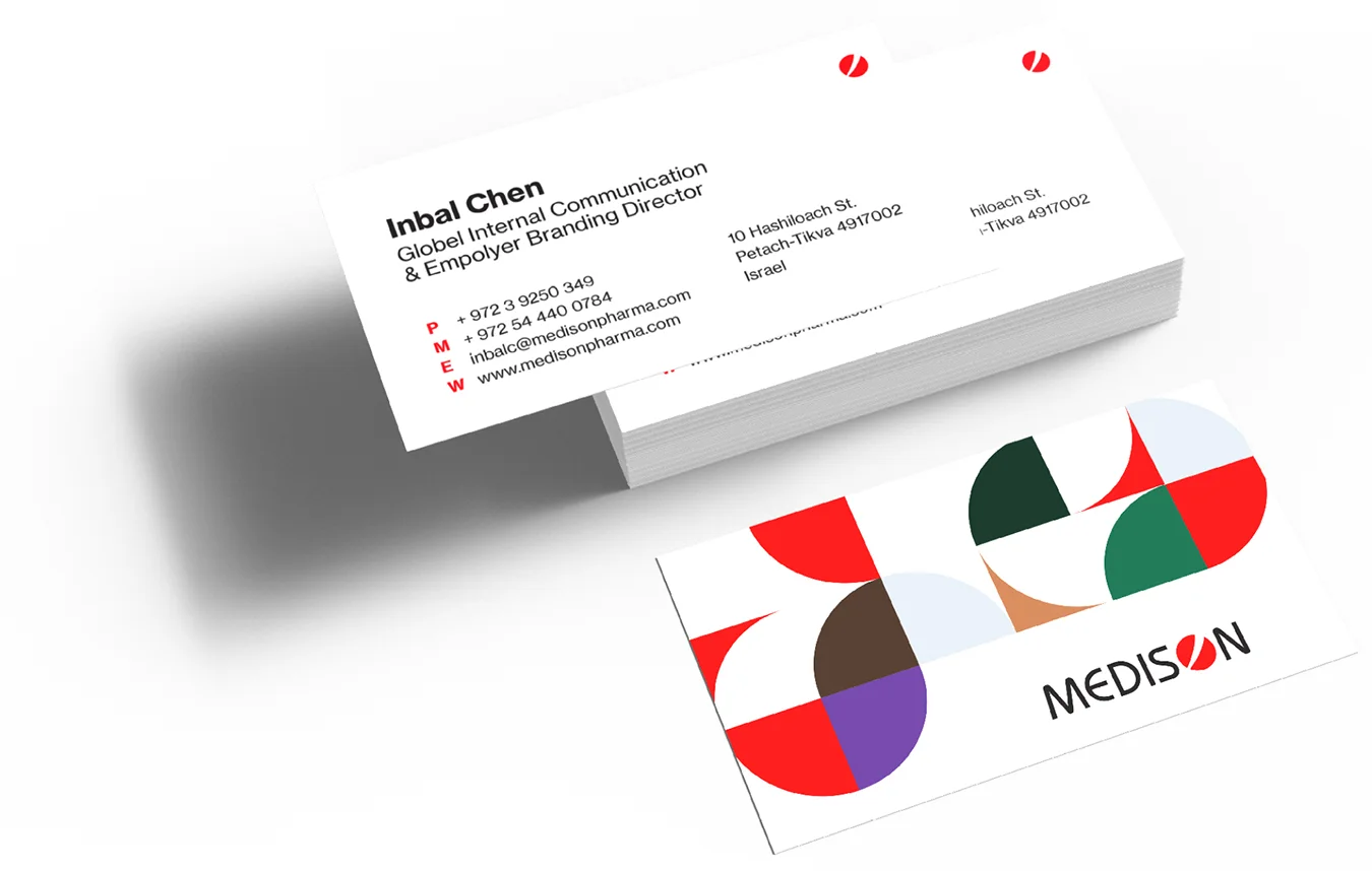
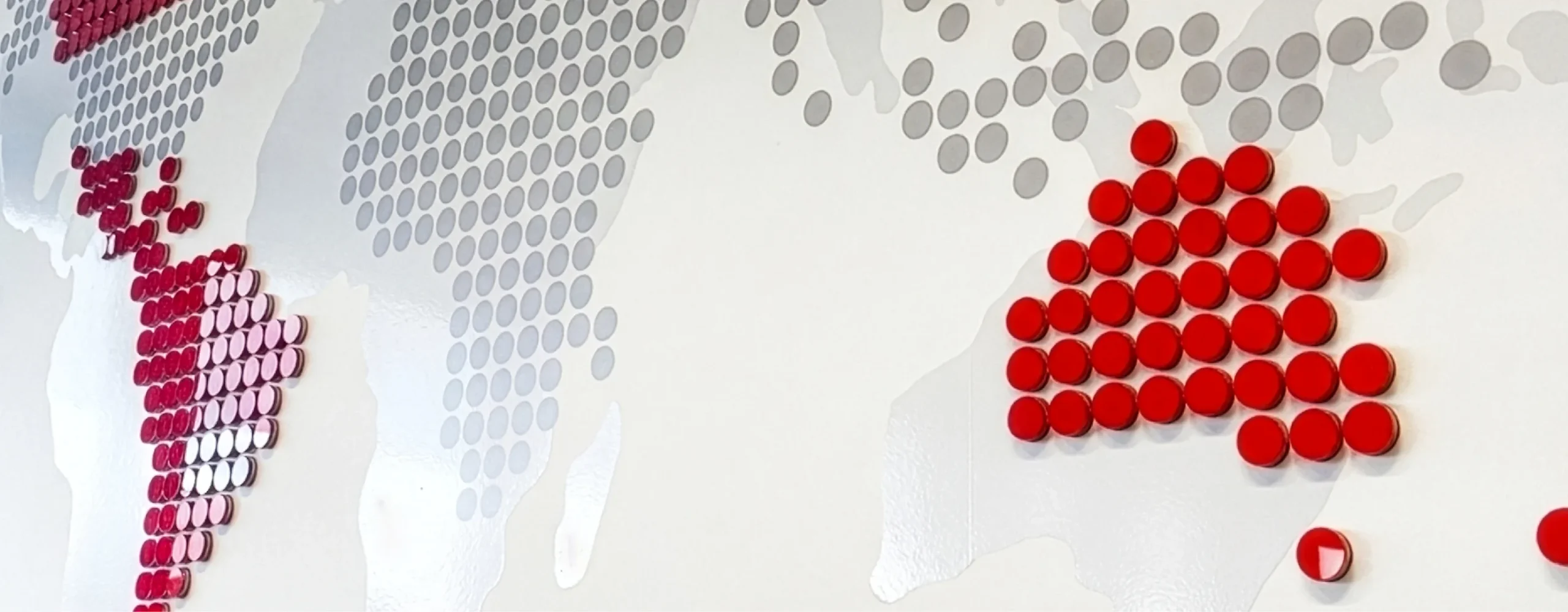
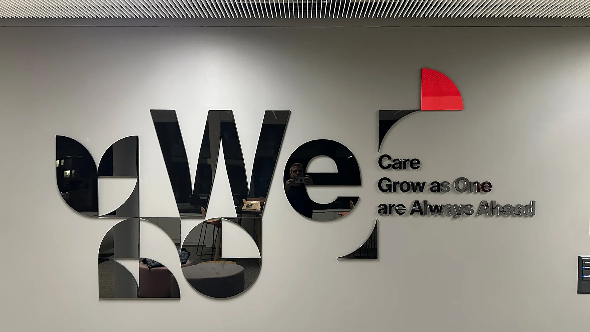
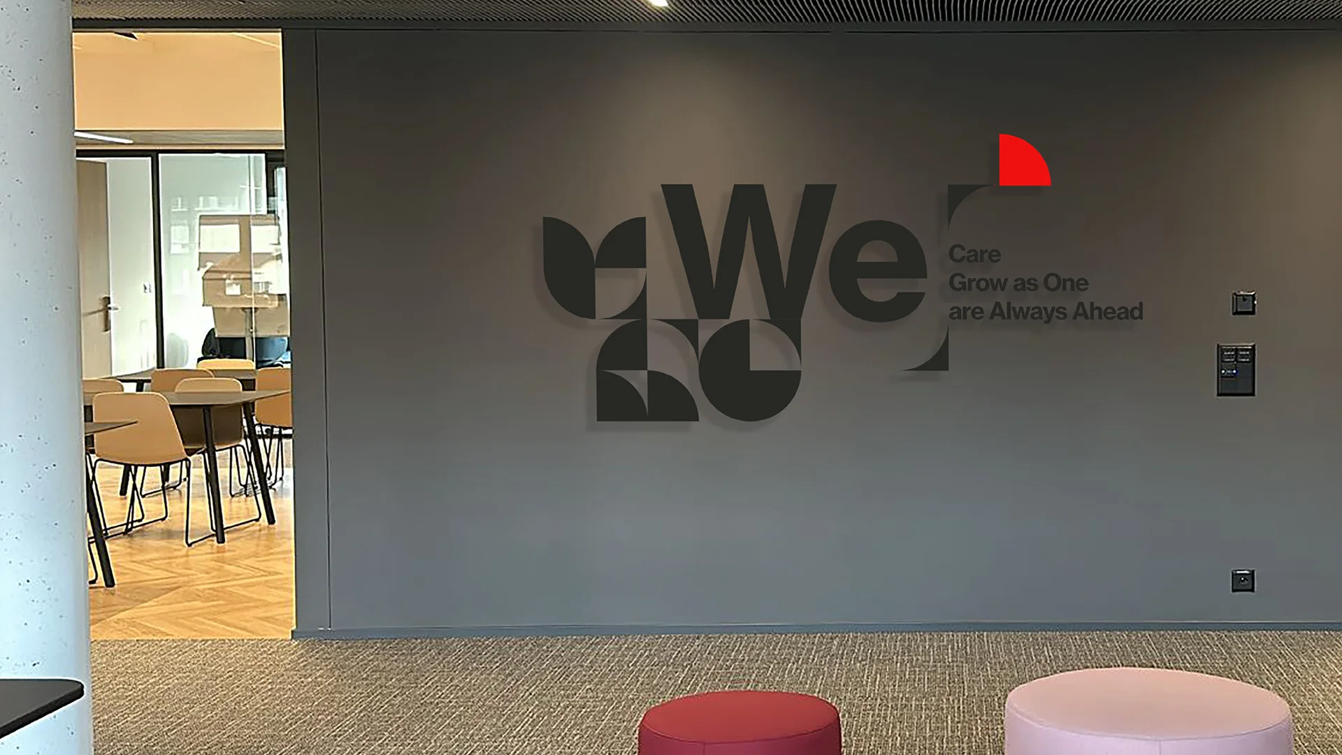
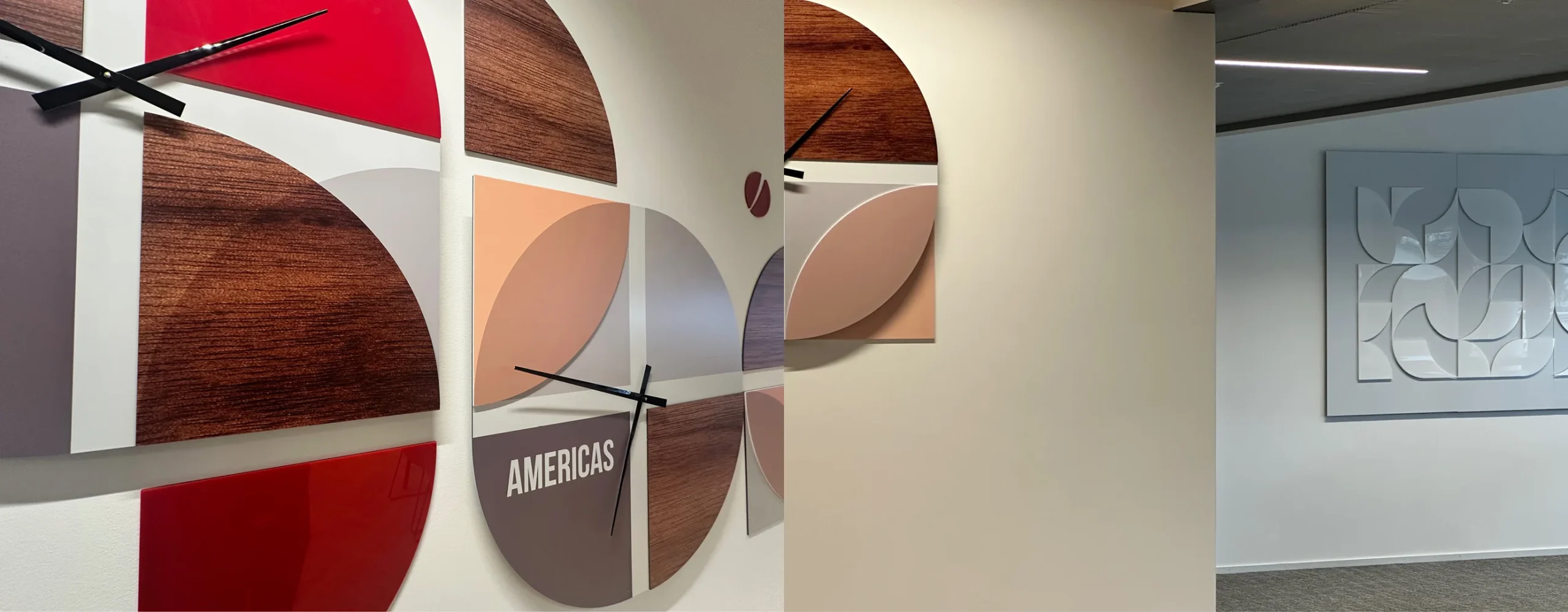
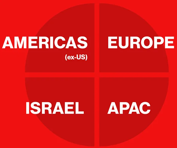
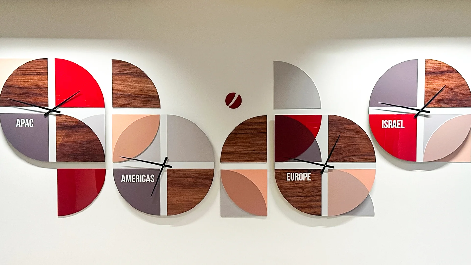
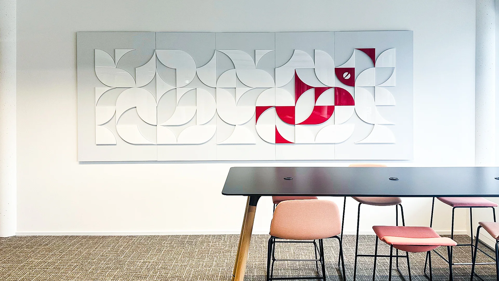
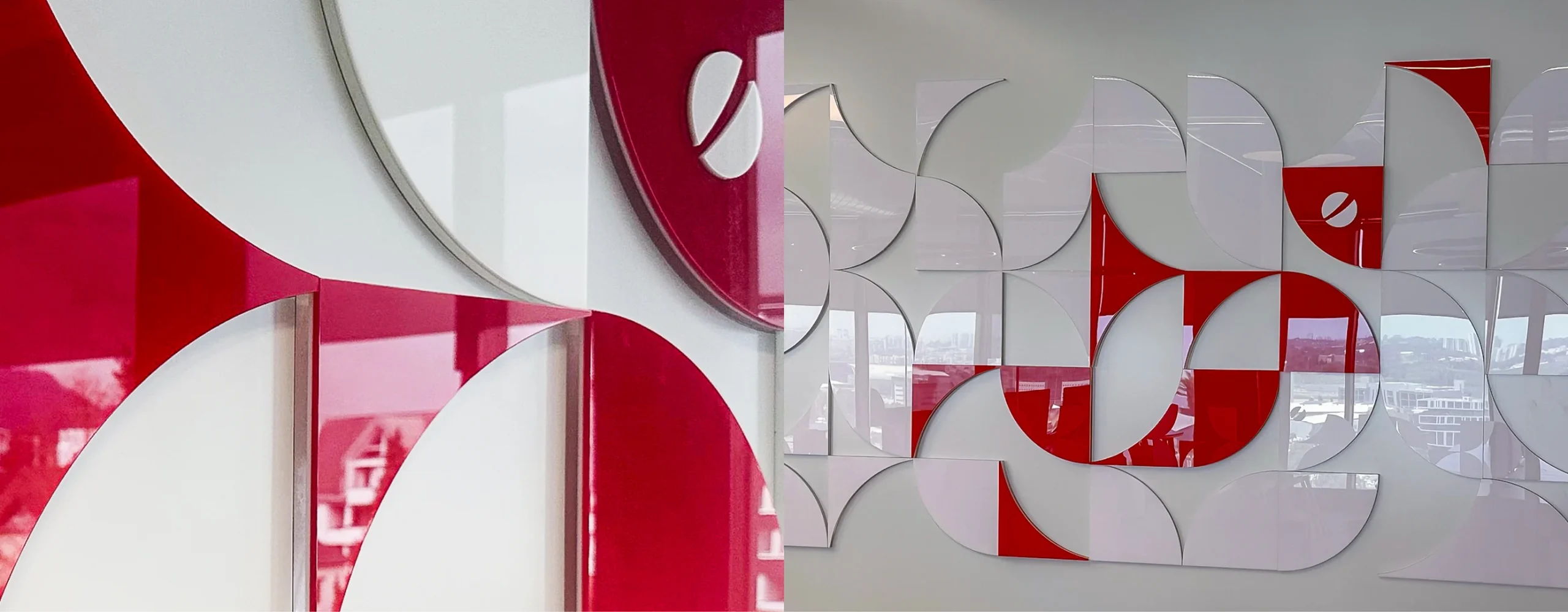
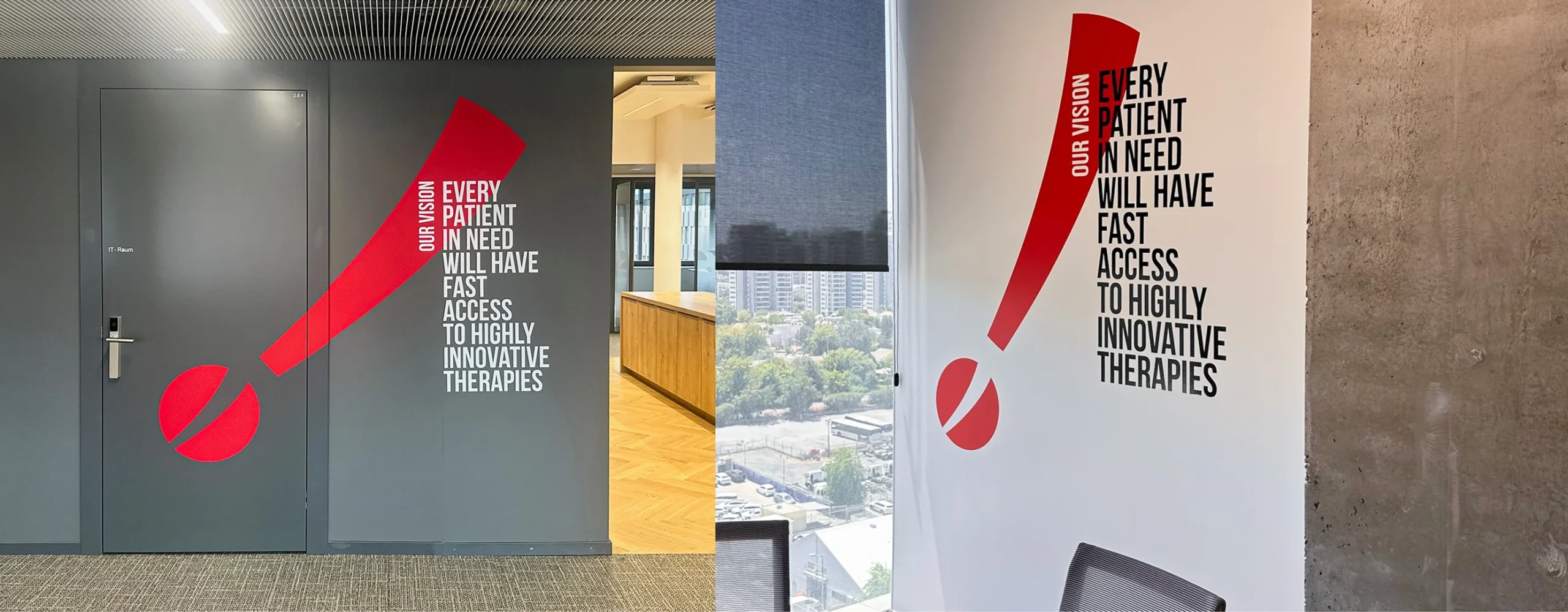
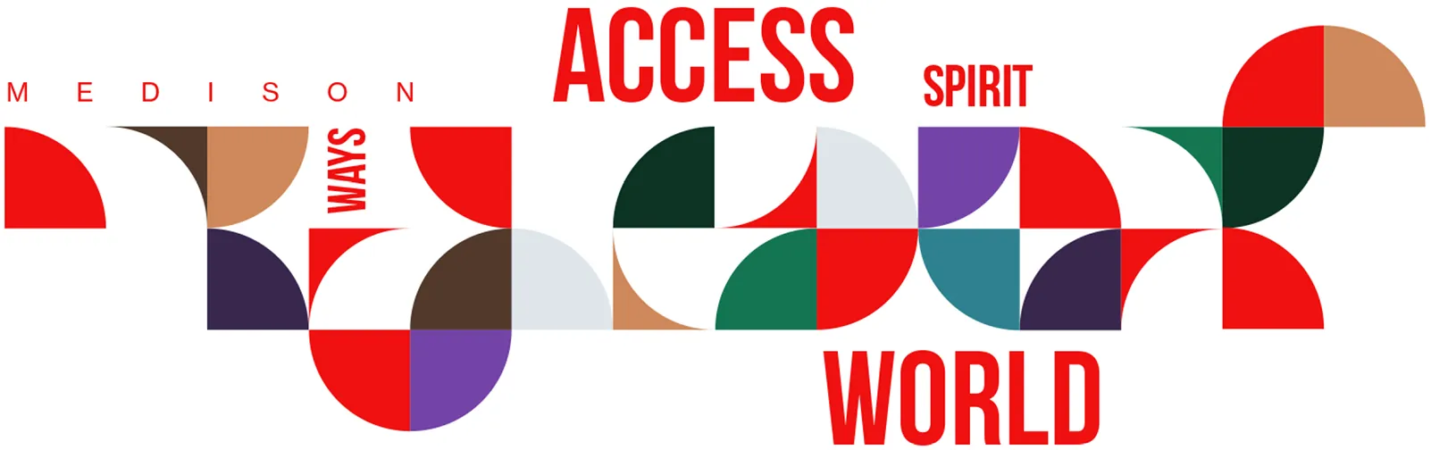
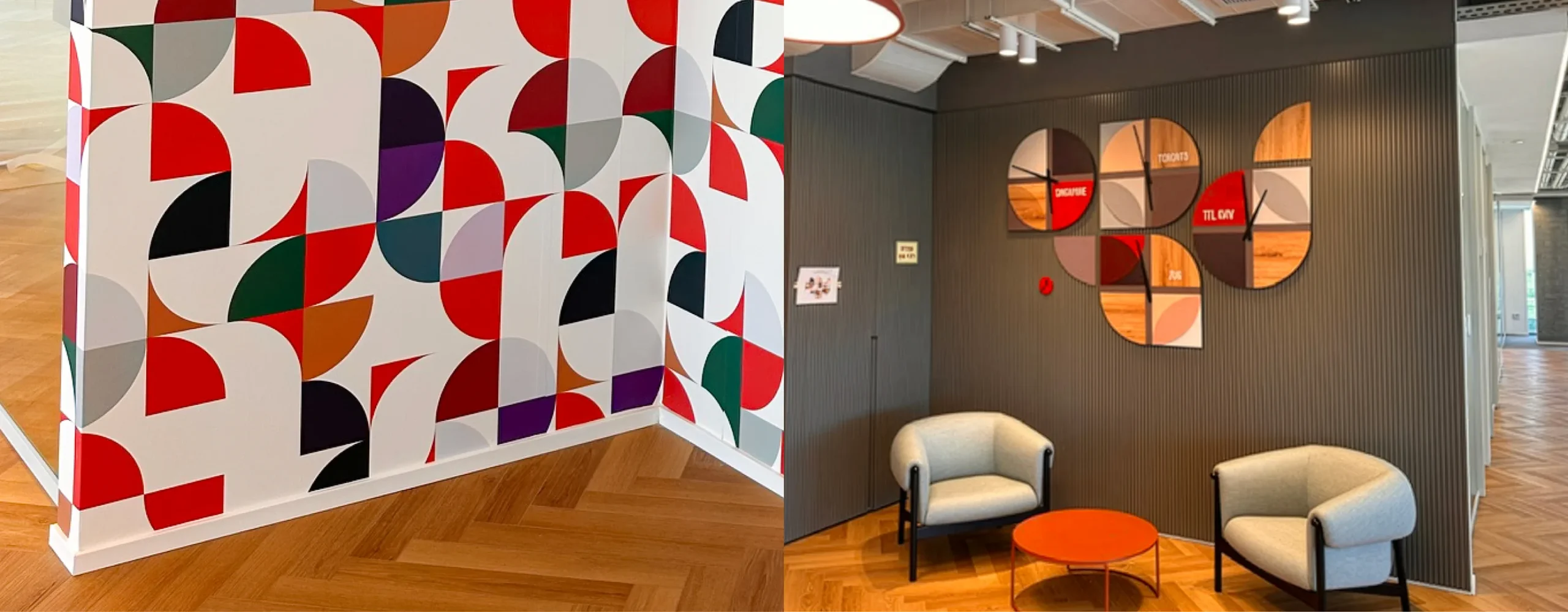
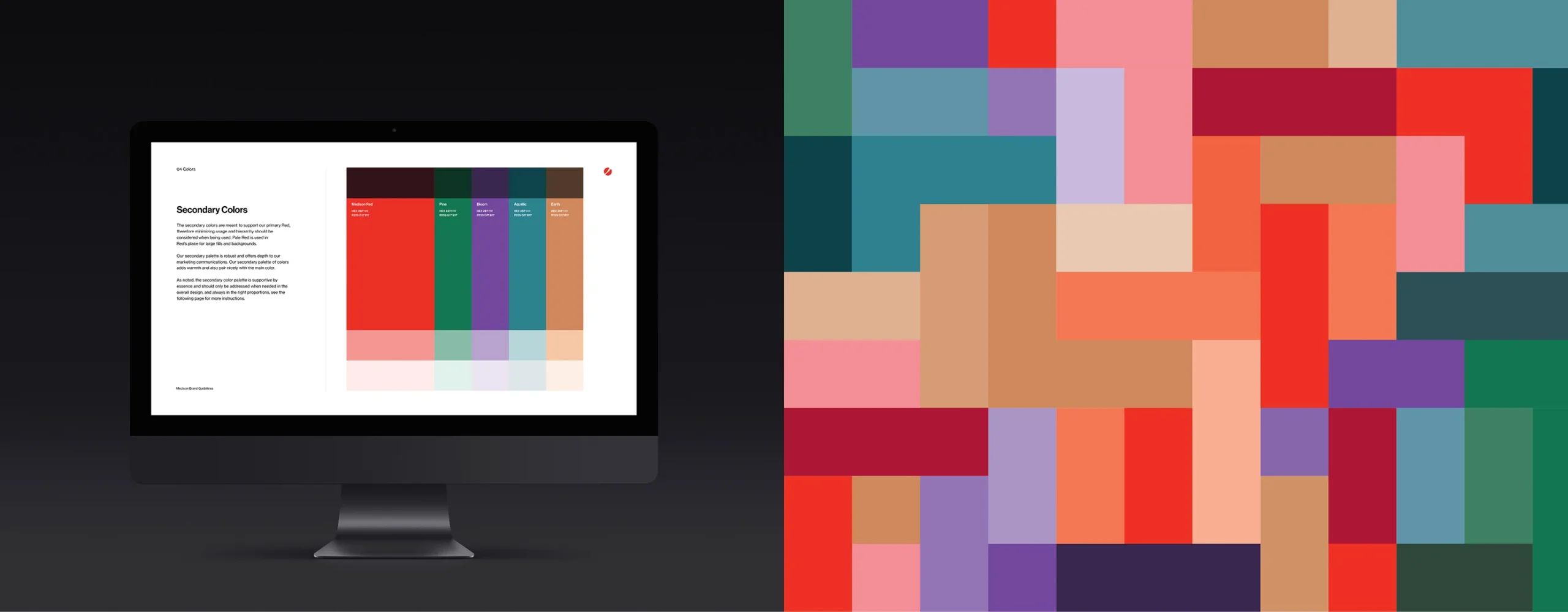
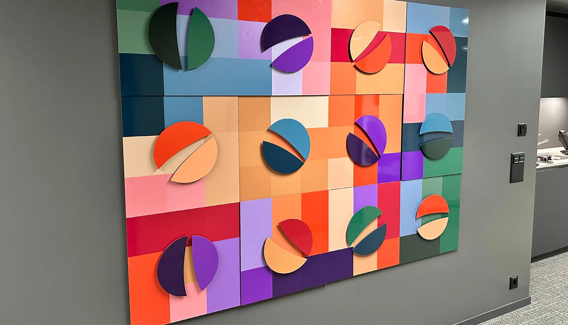
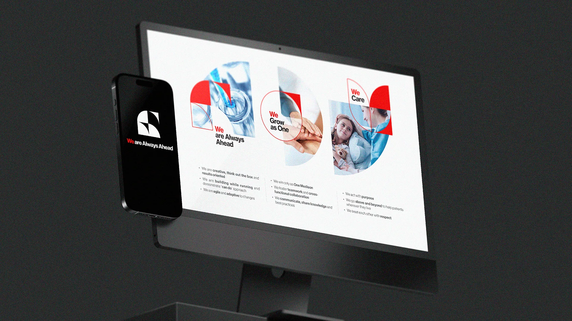
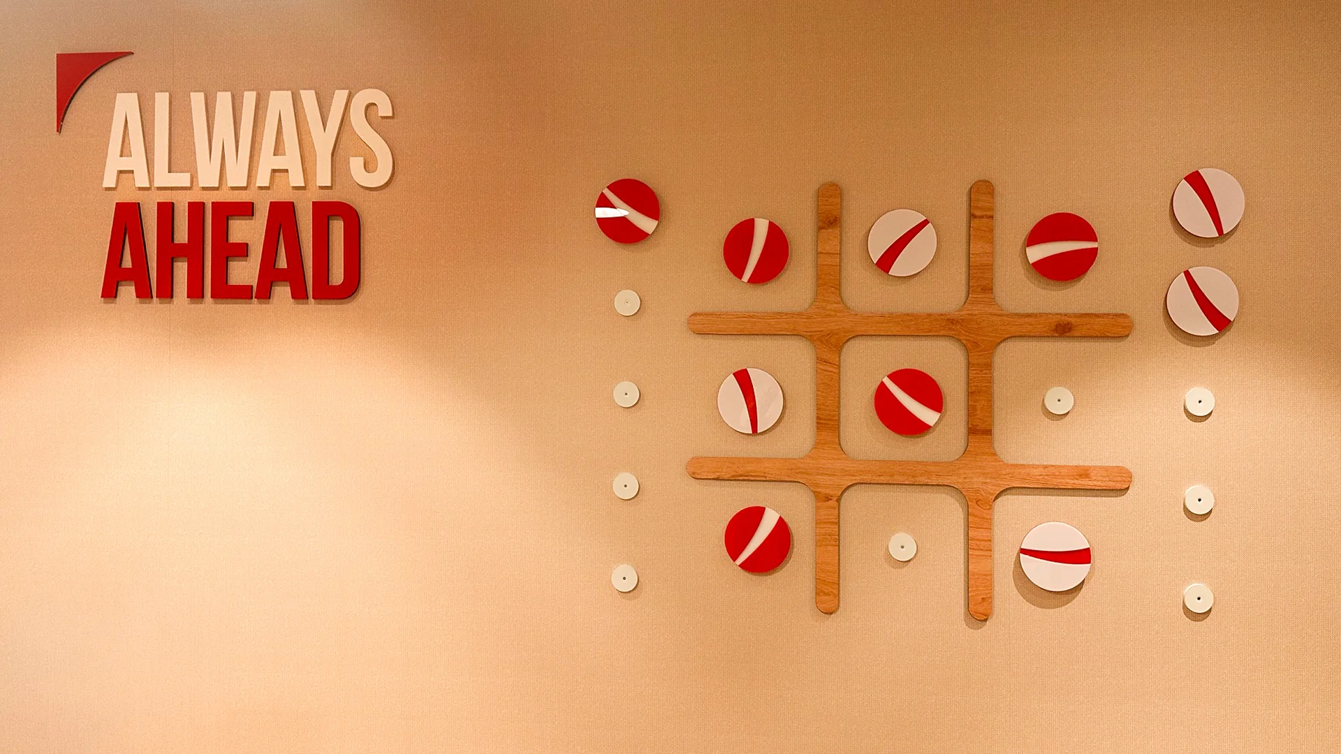
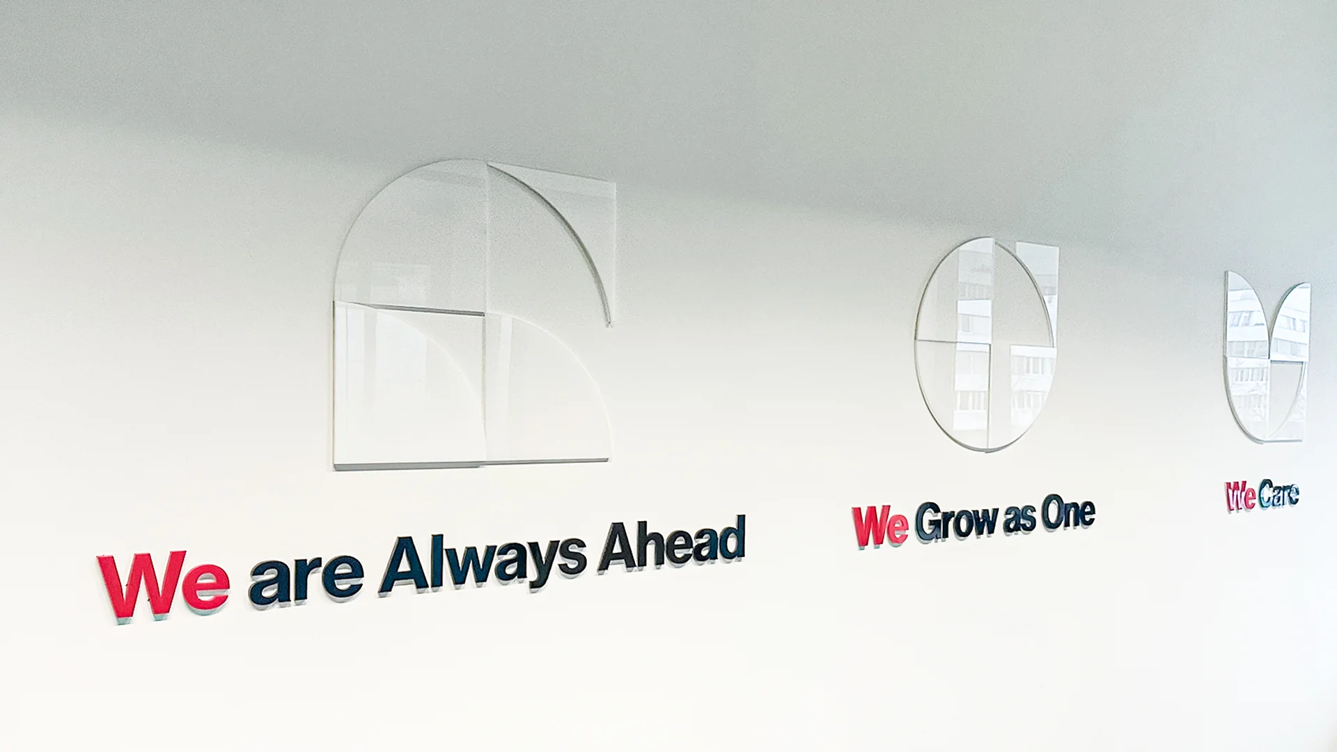
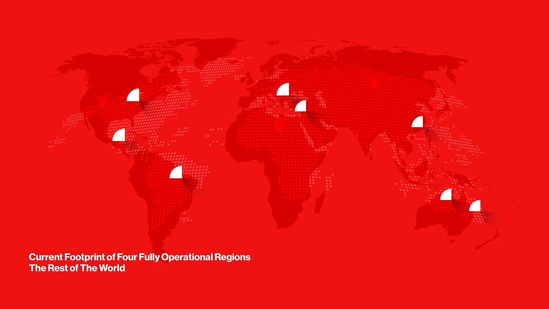
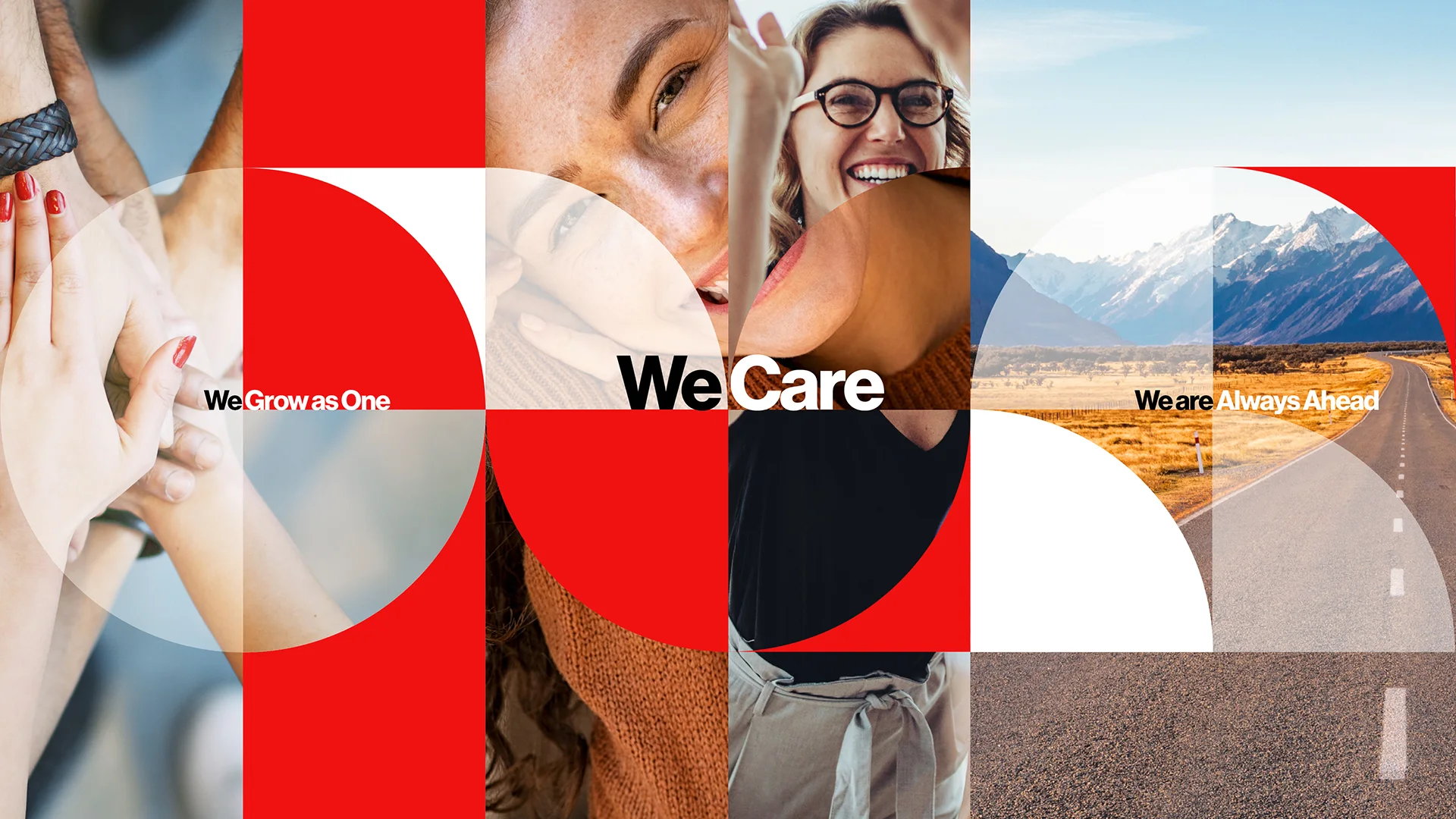
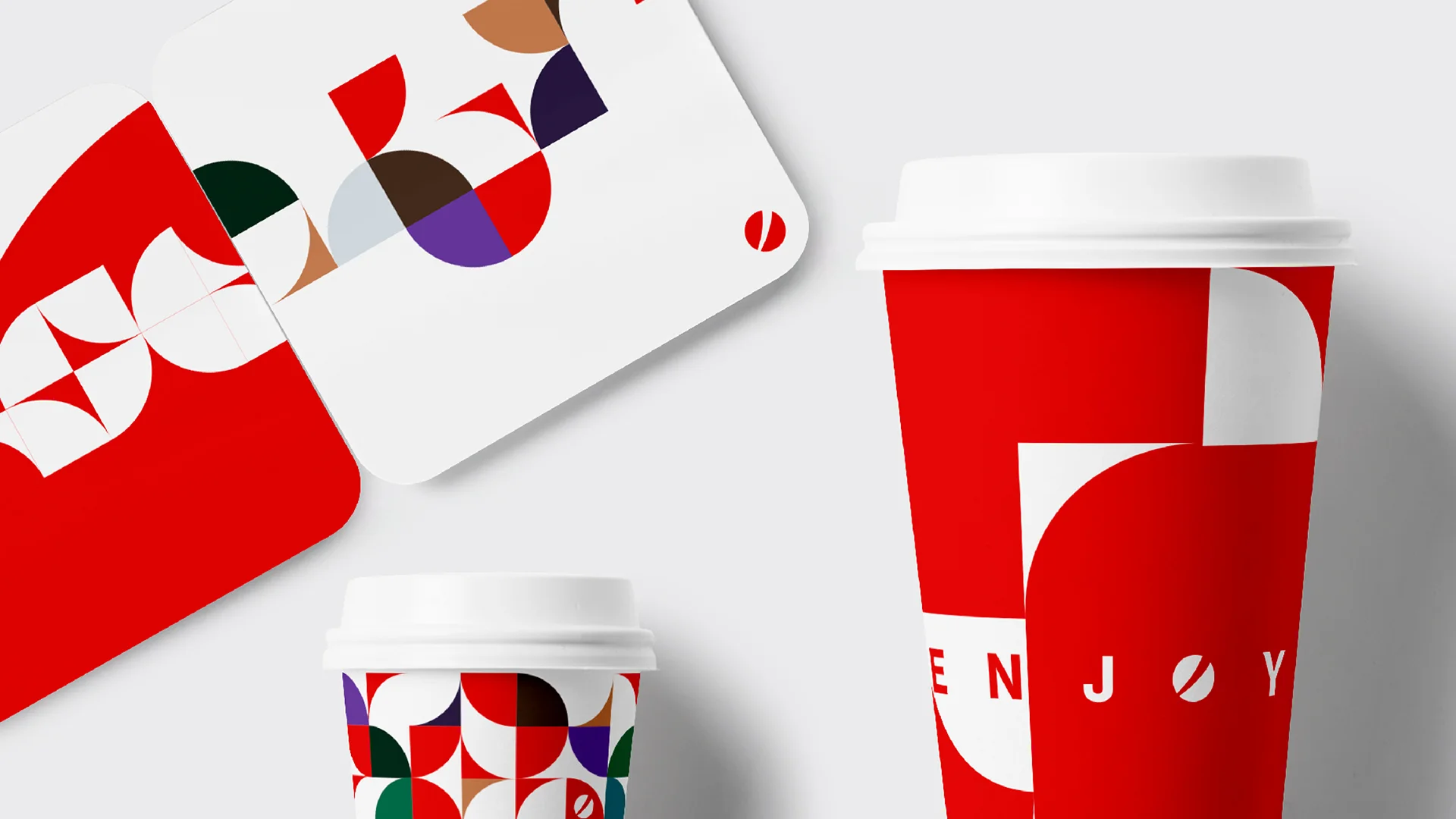
Inspired by the iconic red symbol at the heart of the brand, we transformed a single graphic element into a flexible visual system built from four dynamic segments representing Medison’s global regions while expressing the company’s core values of We Care, Always Ahead, and As One. Through the interplay of shapes, colors, and compositions, we created a rich design language that balances warmth and compassion with clarity, innovation, and forward thinking.
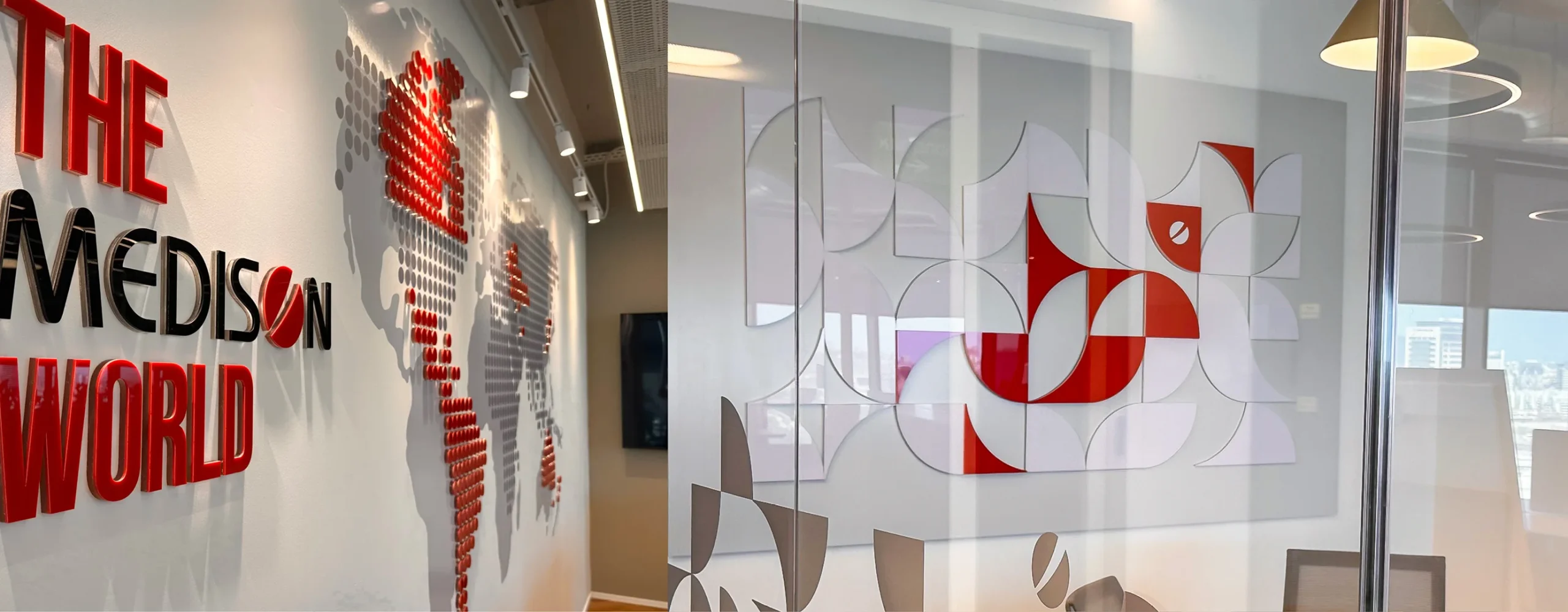
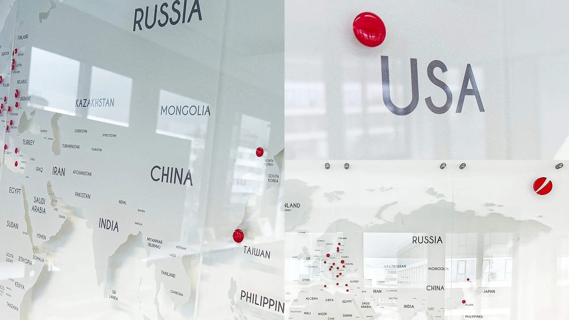
First brought to life at Medison’s global headquarters in Zug, Switzerland, and later implemented in Israel, the concept now serves as the master framework for offices worldwide. Every local implementation is adapted to its environment while preserving one unified visual language, creating a consistent global workplace experience across all Medison locations.